Today I want to talk about one of my newest published research papers, about visualization of multi-dimensional trajectories. It is electronically available here at the Wiley Online Library (http://onlinelibrary.wiley.com/doi/10.1111/cgf.12352/abstract): Visual Analysis of Trajectories in Multi-Dimensional State Spaces [1].

First off, what is multi-dimensional trajectory? We were investigating the state of complex systems, like automation system or robotics. Each element of such a system, e.g. a robotic motor or a sensor, holds several state variables, like sensed temperature or rotation moment applied by the motor. These variables might even be vectors. But even if they are only scalar values, the system is constituted from several dozens of such elements. Thus, the state of the whole system is always a vector containing the state variables of all components. For the systems we investigated, these vectors are of the size of severs tens or variables. This order or magnitude is referred to by the term multi-dimensional, compared to high-dimensional, which refers to data with several hundred or thousand dimensions. The whole system state can be understood as point in the multi-dimensional state space. Now, our system is not static, but is monitored in real time. Thus the values of the state variables change. Temperatures rise and motors move. This can be interpreted as the point of the system state moving through the state space. This movement path is what we call the trajectory.

md_trajectory_teaser

Our approach on visualizing this trajectory was using classical visualization metaphors on multi-dimensional data visualization, namely scatterplot matrices and parallel coordinate plots. We supplemented these plots with additional views, like a temporal heat map. The main aspect of our work was the technique we used to generate these plots. Normally, the sample points of the data will be simply drawn into the plots as points or poly-lines. We, however, took the nature of the data into account, which is the temporal continuity of the discretely sampled signal. We constructed an integration concept for continuous plots in this respect. Our work was based on previous work on continuous scatterplots and parallel coordinate plots, which used spatially continuous interpolation. We adapted this concept to continuous-time interpolation.

 md_trajectory_compare

[1] [doi] S. Grottel, J. Heinrich, D. Weiskopf, and S. Gumhold, “Visual Analysis of Trajectories in Multi-Dimensional State Spaces,” Computer Graphics Forum, vol. 33, iss. 6, pp. 310-321, 2014.
[Bibtex]
@article {Grottel2014HDTraj,
  author = {Grottel, Sebastian and Heinrich, Julian and Weiskopf, Daniel and Gumhold, Stefan},
  title = {{Visual Analysis of Trajectories in Multi-Dimensional State Spaces}},
  year = {2014},
  journal = {Computer Graphics Forum},
volume = {33},
number = {6},
pages = {310--321},
  doi = {10.1111/cgf.12352}
}

Data set file formats are a real running gag in the context of scientific visualization. Often the file formats are rather useless and there often are no established standards. Most of the time ASCII-text files greet you as the results for simulations. These are large, bulky and a pain to parse.

With MegaMol™ we tries to tackle this problem several times, with limited success I have to say. We nicely extended the list of file formats we need to be able to load due to our project partners with a whole bunch of file formats of our own. These, however, have proven themselves to be similar useless in the long run. This year the need for a solution to efficiently load larger data (not yet big data) arose, once again. The best way we found was the MMPLD file format. It basically is a binary memory dump of the simplest data structure MegaMol has to offer.

What can I say? It works. Of course this is no solution with sustainability or scalability. The huge number of failed attempts to create a good file format raises the questions if such a file format can be defined at all. I don’t want to abandon hope. We—CGV-TUD, VISUS, HLRS, ThEt-PB, SCCS TUM, and TLD-KL—at least agreed that we all have this problem, and that we all are interested in a solution. We will see…

This week I was attending the annual meeting of the Boltzmann Zuse Society in Paderborn. It was fun and interesting, like always. The main topic is molecular simulation using molecular dynamics and Monte Carlo methods. Of course, there are also ab initio computations, but these are not that important. With this topic my visualizer-colleagues from Stuttgart and I myself are a perfect fit. Thus, there were man great ideas and actual plans for upcoming joint research projects.

As promised, here my impressions on this year’s EuroVis conference in Swansea, Wales.

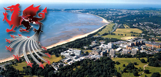
First about the location: Wales offers beautiful landscapes and literally shined with perfect weather during the week of the conference. Several locals assured me that this much sunshine and this little rain was not normal. It’s fine with me. I enjoyed it. I booked a family-managed bed & breakfast. That was a good idea. The room was clean and well furnished. For sure that B&B was not a top-tier accommodation, whatever that means, but my hosts were very nice and I got the feeling, that I was welcome. The only downside was traveling to Swansea, which seems to be far far away. When booking my travel someone did not pay attention to traveling comfort. Thus, I spent one Sunday and the next Saturday in one tram, two trains, two airplanes, one bus, two (delayed) British trains, and one taxi, each. I have no problem with long travels, but changing vehicles eight times is a pain.

Now for the conference itself. It was held at the University of Swansea in four rooms in three different buildings. Due to the large number of visitors, it might have been necessary, however it was tiresome.

Before the main conference, there were several smaller workshops. Although I was part of the program committee of the EnvirVis 2014, a workshop on “Visualization in Environmental Sciences”, I visited most session of the EGPGV, the Eurographics Working Group on Parallel Graphics and Visualization. “Big Data” is one of the major buzzwords in scientific visualization at the moments. Therefore, some of the talks were very interesting, especially the key note given by Valerio Pascucci. The other talks were good quality. For example, one nice idea, although not completely new, was the work “Freeprocessing Transparent In Situ Visualization Via Data Interception” by Thomas Fogal et al.. Preloading for the win. :-) But the approach is good and can be useful.

There was much to see on the main conference. As always, the talks were of good quality. If I write it like this, I mean that these talks were not ground breaking, but that they were good to listen to and to follow. The large conferences always claim to have a higher quality than smaller workshops. In my opinion it is more like that percentage of good papers is higher, like 95% on the large conferences, while smaller workshops have a ratio of 2/3 to 1/3 of good papers and … others. But the quality of the good talks is not different between the large conferences and the smaller workshops. Two talks I liked especially were „Fast RBF Volume Ray Casting on Multicore and Many-Core CPUs“ by Arron Knoll et al. and „Sparse Representation and Visualization for Direct Numerical Simulation of Premixed Combution“ by Timo Oster et al.. The capstone talk by John Stasko also was very entertaining.

The real highlight of this year’s EuroVis, however, were the STAR-Tracks. STARs are State of the Art reports. These are overview reports over a limit sub-field of our science. Good STARs are invaluable and are a perfect starting point to enter a field. This EuroVis gave out a call for STARs for the first time and highlighted them with their own session track. Great! Because of this, some very good STARs were written and presented. I am really pleased. I especially liked “A Review of Temporal Data Visualizations Based on Space-Time Cube Operations” by Benjamin Bach et al.. Not only were the work itself and the presentation of good quality, but during the presentation a lively and constructive discussion emerged with several people from the audience. Many nice ideas were created.

In short, the EuroVis 2014 was interesting and worth the effort. I am satisfied.

I just got back from the EuroVis 2014 conference at the University of Swansea in Wales. I’m still pretty tired from the complicated travel, so this post will be short (again).

The conference was nice, as was the weather. Something you should not expect in Wales, as the locals ensured me. However, I enjoyed the sunlight. Well, for the next post I will prepare some details about the conference.

The German research landscape has many problems. This week I had a very nice discussion with a colleague, about research, the way it is performed today, will not solve any problems. Every researcher only hunt’s for funding, the ones with more ambition hunt for tenure. Doing so, they produce as many papers as possible as fast as possible, to display their excellent scientific quality. As a result, none of the problems they work on is ever solved completely. Every single time, special cases are excluded and only data sets are published which work well, neither representative nor complete; but published. Thus the research community accepts the publication as solution for the corresponding problem. The people having the problem are the upcoming researchers and PhD students, which need to use that stuff. If the only want to continue research, they are forced to make the same simplifications as before. If they want to really used the “solution” to work, they have to solve all the special cases, add robustness, performance, whatever. The tremendous amount of work they have to invest will not be recognized by anyone, since the research community already believe that problem had been solved before, hindering any new publications with the actual working solution. Thus researchers are forced to work with 1/4 solutions all the time.

So what about industry? They could create the full solutions. … Why should they? The industry creates their own solutions, especially tailored for their own problems. They are not interested in generic solutions for a broad audience, and rightly so.

This view of my obviously is limited to the research I see around me, namely the work in computer science. I hope other fields do better research.

So, how do we go on? … Well, exactly as before. There won’t be solutions and we will burn money.

Not all points are equal. There are always fundamental misconceptions about the type of data I am working with in my visualization research.

I work with particle data. This data is usually the result of simulations, e.g. generated through the methods of molecular dynamics or a discrete element method. The individual particles represent independent elements, e.g. atoms or mass centers, which are neither connected nor correlated. Of course, within the simulation these particles interact and influence each other, but with the pure data which is available for visualization to me, there is no topological structure between the particles at all. Literature was several further names for this kind of data: point-based data, mesh-less data, and, maybe the best fitting one, scattered data. Technically speaking, these data sets are arbitrarily sorted lists of elements, each storing a position and optional additional attributes, like a sphere radius or a color. But that is it. There are no more information and in general you cannot make any assumptions about structures within the data.

bunnyPSP-OSSI now want to write about one very common misconception: there is the further data type of point clouds also called point-set surfaces. These data also consist of a list of points, which are at first not correlated. Typical sources of such data are point-based modeling in 3D computer graphics and, more common, scanning of real-world objects. Such scans would be created by laser scanners or structured-light scanners like the Kinect. Because of the fact that these data sets store a simple list of points, i.e. they are technically identical to particle data, results in the misconception of many people that these two types of data sets are identical. They are not.

Point clouds are discrete samplings of a continuous function, i.e. the surface of the scanned or modeled object. Therefore, all points reside, within some error margin, on this 2D surface embedded within the 3D space. This aspect is fundamentally different from particle data, in which the particles are freely placed throughout the 3D space. Almost every algorithm working with point-cloud data work with the assumption of the continuous surface represented by the points. As this assumption is not valid for particle data, these algorithms cannot be applied easily to this kind of data.

Well, obviously I have not published enough to make my colleagues in my field of science recognizes this difference. I am off then …

At the end of this week it was time for two important demo-days.

On Thursday the Output took place. Some kind of open house of the TU Dresden, at which scientific results and student’s works are presented to the public. Together with booths from industrial partners this mini-exhibition provides an overview of the output of the university. And this time, our demonstrators were particularly important. The junior research group VICCI, I am working in, is attached to the ResUbic lab, a cluster of multiple research groups working on the topics of Internet of things and cyber-physical systems. For many research groups within this is the last year of their funding period. Therefore, they understood output as their opportunity for a final presentation. So, they invited many important persons: industrial partners, press, and even government officials. Because of that, we put much effort into our demos, to make the best impression possible.

The best demo of VICCI, although I might be biased here, is the follower demo my colleagues Alex and André set up. It shows a combination of simple robot control and computer vision. To be more precise: the show a demo of object tracking. The robot is equiped with a camera, in our case a Kinect. With this sensor it lerns an object and then tracks this object within the camera’s image. In this photo we used a red coffee mug. The robot tries to keep a constant distant and a direct orientation towards this object. With this it is possible to remote control the robot by simply moving the mug correspondently.

Now, this demo is not that great because we can control a robot with a coffee mug. That is nice, but that is no rocket science. What is great is the object tracker. Alex uses a particle filter algorithms, based on probability distributions to assume the object position. This tracking is robust and very fast. A new object can be lerned within fractions of a second. Any object can be used, even bare hands.

On Friday the second demonstration came up directly after the Output: the long night of science (lange Nacht der Wissenschaft). We basically showed the same demonstrations as we did at the Output. Just some of the research groups of ResUbic did not want to. We did. We presented our work of VICCI to the broad public the whole evening and night, until the end of the day at 1 o’clock.

As conclusion I can say, that these two days were exhausting and that I am happy that this is finally over. Apart of that, our demonstrations were a complete success and the public liked what they saw.