Today I present you the Checkouts Overview tool.
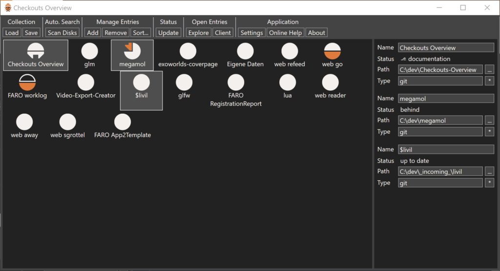
https://github.com/sgrottel/checkouts-overview
https://go.grottel.net/checkouts-overview

What? Why? Because this little tool helps me.

In my private setup, I have a lot of smaller repos checked out, and work on them only occasionally. In addition, I got several repos to collect the history of some text documents. Some of those repos are synced against servers which are only occasionally online, partially for power saving or partially due to VPN and network connectivity stuff. As a result, I often keep losing track of the sync states of all the different repos.

Is everything checked in? — most times, yes. If the change was complete.

Is everything pushed? — maybe.

Am I on branches? — no idea.

You might not need this app, if you have a better structured work process with your stuff than I do. I don’t, so I need help by a tool, by this tool.

If you are interested, you find more info in the app’s github repository.

Note: and as for the app’s icon, it’s about (repository) clones, right.

This is my second article in my series around application icons and logos. This time I want to write about colors and icon backgrounds.

Icon Color Design

Icon shape and color is most of the time defined by a corporate identity. There is then little room for creative freedom in the concrete implementation of an application icon. And, that is a good thing. Visual consistency and memorable colors and shapes are important for a brand identity to be burned into everyone’s memories. Think of the Golden Arches. I bet you can now almost taste the greasy fries.

So, designers working on an icon representation of a product or a company will, on the one hand, need to adhere to a lot of inflexible conditions dictated by the corporate identity, and, on the other hand, will try their best to create an icon usable in many situations.

I will use an older application Icon of FARO® SCENE as an example:

This icon nicely follows the design guidelines and provides a nice compact representation of the product. Some exemplary details:

  • The “S” is based on the full product title brand guideline,
  • The circular border is based on the FOCUS laser scanner brand guideline, and
  • The colors follow FAROs brand guideline of that time.

To account for some flexibility in usage the icon was designed for white (bright) background and dark (colored) background. Not an unusual approach. You can often find this approach if something is designed for digital media and print media.

And all is well, right…

Background and Shape

… More like “no”.

While the idea of having variants of an icon for different backgrounds is valid in general, it is not valid for application icons. An application is one executable binary file. With one representative icon embedded. In most scenarios, there is no way to select variants.

And, to make things worse, the icons will be used on all kinds of backgrounds. Think of a personal computer with a desktop background image chosen by the user. It can be anything in color! And as a result, the icon will need to be compatible with anything. The original FARO icon was not.

The only viable option out of this is to explicitly include a background color as part of the icon. The first versions of that icon did just set the background color.

This does work, to make the icon appear as designed. But it also completely disconnects the icon from the surrounding. The icon is not really part of the desktop or the start menu. It feels like a foreign object. Not nice.

The solution is not that hard to imagine: include the background in the icon. … Did you see what I did here? Do not just “include the background color”, do “include the background.” That is color and shape! Make a part of the background yours. An easy way to do this, is to use a background shield following the shape of the icon itself, often a circle, but sometimes a more complex shape.

The shape of the background, following the shape of the rest, becomes part of the icon. It’s no longer a disconnected image. And, if the desktop background color and the icon background color merge, then the backgrounds merge, and the icons exists as designed. No problem at all. Very good.

And, if you want to further strength the connection of the icon with the colorful background, think of using a little amount of transparency. Don’t go overboard with that. It is easy to create something which looks strange, imprecise, and ugly, with too much transparency. A little bit is all you need. This not-current version of the Steam icon is an example which does a great job on this.

Summary

For an application icon you cannot control the background color it will be placed on. You must be ready for every color.

To still be precise in your icon design, make a little bit of the background part of your icon. Not just the color, but the color and shape. Closely align the shape with your icon to create a consistent look.

Series

I believe, there is a very high number of people, that study computer science, and enjoy computer games or video games. I am certainly one of them. And, I believe, most, maybe all people of this group, have at some point in their lives writing their own computer game. Or, at least, they started to do so. Again, I certainly have. Well, but writing a computer game is a lot of work. Especially, if it is something bigger than “Tic Tac Toe.” And, for that very simple reason, most people never finish any bigger game. Again, I certainly have not.

Over the years, I had plenty of ideas. Some were big, some were small. All were too big to get anything done. SpringerJagd is a good example. Not too big. Maybe not a good idea at all. But, anyway, too big for me to finish.

But is “too big” really the problem here? In the Indie-game community, there are quite some games, which can be considered big. And those are sometimes written by a single person. So, what is the difference?

Perseverance! Focus!

Do not try to do too many things. Focus on one project, and see it through to the end.

I want to do this now! (There is no “try.”) I selected “Exoworlds.net” from my long list of ideas.

Exoworlds.net has quite a history, already. I had the first idea for this game back in Highschool. Over  the years, the game idea shifted, changed, simplified, and got better focus. I believe, the idea I have right now, is a pretty good one. At least, I believe, it is a game I would want to play. I will write a little more about this game idea, soon.

So, from now on, all private software project must be directly or indirectly support the project Exoworlds.net. I am hyped.

Redate is another tool in my growing toolbox. The idea is simple: many applications generate files, write files, update files, with exactly the same content as before. The file write date, of course, is updated. The content stays the same. Other tools, then again, us the file write date as indicate if the files have been changed. Which makes sense, right.

So, this little tool, “Redate,” stores the MD5 hashes of the files, and their original write dates. When the tool is then re-run on that list of files, it restores the original write dates for all files with unchanged MD5s. And, that’s it.

I use it for Vue.js projects, to keep the write dates of files in the dist folders. Then, a simple FTP-sync only needs to update changed files for the final deployment. This helps for projects with many unchanged assets.

You can grab source and binary releases from github.

I decided to write a small series of articles about application icons and logos.

Let me start with the little disclaimer that you should take everything I write with a grain of salt. I have no formal education in design, art, or whatsoever. Sure, I read books and online articles about it, and I believe I have a good intuition, but there is a real chance, that I am wrong about stuff. In this article, I write about my own opinion. And, while I am confident in what I believe is right and important, I might be wrong, or, at least, what I claim to be true might not be applicable in your situations. Whatever. Now that you have been warned, I am happy to spread my humble opinion on this topic.

In this first, short article I want to tell why I think this topic is important, and what are the differences between the “logo” and the “icon,” and why you want to have both.

Why is it important?

I am a software developer. So, my view is from this angle, and I am talking about logos and icons of software applications. But this is similarly true for more generic projects, smaller tools, software eco systems, websites, products, etc. All those are things we work on, we work for, we implement and deliver. And very often, if things are going well, those are things we are invested in. We want to deliver our best work, and we want to make those things successful, not just for the good of the company. If the projects are cool, and we like working on them, we want to succeed just because we want to.

To create this level of dedication and investment, it is beneficial if the object we are working on has an identity. The first and most important aspect is a name. We need to be able to call the project by its name. I am working on “that thing, you know,” does not really sound invested. But, when I am saying, “I worked a lot on MegaMol,” it gets personal. You do not have to start with a final title. A project title will work just fine. It might actually stick, like a nickname.

I am a visual person. Icons, logos, posters, covers, etc. this all helps me remembering things and recognizing this. Visual representations are very powerful in this regard. And this is exactly, where icons and a title come into play. Add those to your project or application, and you can boost the strength of the virtual identity.

What is the difference between Logo and Icon?

There is a subtle difference between a logo and an icon. A logo is a graphical representation of the title of your project. And the title is a written representation of your project. An icon is an often abstract, _iconic_ representation of your project itself. So, it always about the project. The icon does not have to be part of the title or does not have to be derived from the title. It does make sense to have visual connections between title and icon, but you do not have to force it. The easiest way is to include the icon in the title as graphical element.

A typical example is Mozilla’s FireFox.

The name is not really semantically connected to what it is. It is just a name. There is a ecosystem of matching names for matching application, though, but, for this example, it is not important.

The icon, or “Logomark” as Mozilla calls it in their documentation, is an iconic representation of the name. Very good.

And the logo is the name, the icon, any typographic specifications: font, sizes, spaces, etc. The logo then is a combined graphical entity. It is not just the icon and a text. And that is why you should not try to recreate it, and why the logo itself should be delivered as vector graphics without referencing any fonts. Often, it makes a lot of sense to adjust the fonts in the logo, to fine-tune kerning, modify shapes of specific characters, etc.

Summary

To have a strong identity for your project, you want to have a name, an icon, and a logo.

  • The name will be used everywhere. I can be a preliminary name, a project name, or a nickname.
  • The icon will be used in software application UIs, software executable icons, website favicons, websites small logos, etc.
  • The icon is an _iconic_, graphical representation of the project, not necessarily of the name.
  • The logo will be used as larger website logo, on presentations, and written documents.
  • The logo should have visual connections to the icon, and logical connection to the name. It can be a combination of those elements.

Series

I got my “wisdom,” I like to call it that, from many different sources: family, friends, movies, … It’s also often called “useless knowledge.” I can live with that too. And things get most interesting, when we are talking about things which are not (fully) under our control. Opinions then become more and more reflections of how we see things, and not how they are. Well, opinions always are that way, but in those cases this becomes more and more apparent. Let’s take our jobs for example, we love ‘em, we hate ‘em, we need ‘em. If you’d ask me to look at it from an academic perspective, I’d like to first introduce a scale (based on my useless wisdom):

The upper end is defined for me by a quote from Confucius. Actually, the last time I heard it, was when my sister read it to me from Kermit the Frog’s Instagram.

“Choose a job you love, and you will never have to work a day in your life.”

And for the lower end, which is not that negative at all, I choose a quote from “The Devil Wears Prada.”

“Jobs that pay the rent.”

Well, that is not Confucius, but it certainly does hit the point we oftentimes feel.

Obviously, it’s an open scale from 1 – Love to 0 – Rent, and beyond at both ends. And, there certainly is something like “That’s it. Here is my resignation. Fuck you all.” as well, but I do hope that range is not needed very often. Let’s put that to -1.

So, there you are. A nice Scale between Love and Hate, about our jobs.

If you had one of those days, and you feel like close to zero, or even in the negative, then try to remember a previous day, where you were close to one. Got it? Keep at it. You’re goal for work is to make those days count! And to have more of those days that the others. And, for the other days, don’t forget about your life outside of your job as well!