This is my third and final article in my series about application icons and logos. This time I am going to write about icon sizes, and why you should care for it. Granted, it’s a little bit about perfection, but it is about an easily achievable optimization. Look at those two images:

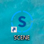
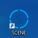
These show the same icon. The very same icon. Really. And both show the image at 32×32 pixels.

Icon Sizes

Let’s reiterate what icons are for: it’s an iconic, graphical representation of a logo, especially optimized for small sizes, like favicons, small logos or software application icons. They are meant to work at very small sizes, traditionally down to 16×16 pixels. With higher resolution displays, this super-small size might no longer be that relevant. That is why I chose 32×32 for my example above. So, we want icons to work for those small sizes. Yes, we explicitly create icons for those small sizes. And this is my argument, that we should go the extra mile also optimizing the graphics for exactly those sizes we aim for: 16×16, 24×24, 32×32, 48×48, and 64×64, traditionally.

So, what is the difference between the two images above? Let me zoom in without additional interpolation to make the difference more clearly visible:

The left image is the reference image I got from the clipart. It does show what I want to show, and might come from an external design source. But the lines do not align with the pixel grid. As a result, anti-aliasing interpolation results in the blurry visual. The right image, is the same graphics, but all the line vertices have been slightly move to align exactly with the pixel grid. The result is a much crisper appearance. And the effort it minimal. Just a duplication of the icon and touching and snapping of a couple of vertices in your favorite graphics editor. Totally worth it.

Ok, so, can’t we just optimize for 16×16 and we are good?

No. For one, 16×16 is very very small, and as written above looses it’s importance in the age of high resolution displays. Similar to the abstraction from a logo to and icon, as written in my first article of this series, many icons simplify and remove details when they go down from 32×32 pixel sized versions to the 16×16 pixel sized versions:

And the second reason are the in between sizes, infamously the 24×24 pixels. It’s a scaling factor of 1.5x from the 16×16 version. Any line might end up again in between pixels and blurry if you just scale up.

So, it does make sense to create multiple sizes of the icon, each with optimized placement of the graphics’ vertices. At some point, depending on the complexity of the icon’s graphics, further upscaling is irrelevant, and can be done automatically. The 64×64 pixel size is a traditional point for this.

Personally, I usually try to design icons at 32×32 pixels. The 64×64 pixel and 256×256 pixel versions are then automatic upscales, but are always explicitly included in the icon files. The three traditional sizes still missing, 16×16, 24×24, and 48×48 pixels, are the manually optimized for crisper appearance. Of course, this approach is just a starting point, and sometimes the reference is at a different size.

The Straight Lines

So, all this is only about straight horizontal and vertical lines, as only those could perfectly align with the pixel grid? No. Any shape loses detail and gets increasingly blurry at smaller sizes. I wrote above that the reduction of graphical detail might be needed when going down in size. That is true for all shapes. And it might not only be a _reduction_. Sometimes an alteration or even complete replacement of a shape might make sense, as in the example above. Especially, when going to 16×16 pixels in size, the concepts of pixel art, with their reduction of most detail an especial emphasize on other detail is worth a thought:

The right image show the clipart original. The center image shows the vector graphics of the 16×16 pixel image on the left. Look at the strap of the helmet. That is no longer curved at all. Instead it emphasizes on a couple of full pixels for the overall shape, and a couple of partially filled pixels for explicit an controlled anti-aliasing.

Summary

Icons are meant as very small sized representations of a logo and for your application, web page, or similar. As it is their purpose, I argue we should care for optimizing for those sizes as well!

  • Shapes, especially, but not limited to, horizontal and vertical lines, should be placed precisely at pixel grid boundaries to avoid blurriness due to interpolation.
  • 16×16, 24×24, 32×32, and 48×48 pixel sized versions of an icon benefit most from manual optimization, maybe even graphics detail reduction or shape alteration
  • Whatever we do, let’s keep quality always in mind.

So, an SVG, which is only one image at one size could be used as an icon image data source. But if used for all sizes, it will always fall short in the visual quality on some sizes, compared to explicit pixel-based graphics, optimized for that specific size.

Series

This is my second article in my series around application icons and logos. This time I want to write about colors and icon backgrounds.

Icon Color Design

Icon shape and color is most of the time defined by a corporate identity. There is then little room for creative freedom in the concrete implementation of an application icon. And, that is a good thing. Visual consistency and memorable colors and shapes are important for a brand identity to be burned into everyone’s memories. Think of the Golden Arches. I bet you can now almost taste the greasy fries.

So, designers working on an icon representation of a product or a company will, on the one hand, need to adhere to a lot of inflexible conditions dictated by the corporate identity, and, on the other hand, will try their best to create an icon usable in many situations.

I will use an older application Icon of FARO® SCENE as an example:

This icon nicely follows the design guidelines and provides a nice compact representation of the product. Some exemplary details:

  • The “S” is based on the full product title brand guideline,
  • The circular border is based on the FOCUS laser scanner brand guideline, and
  • The colors follow FAROs brand guideline of that time.

To account for some flexibility in usage the icon was designed for white (bright) background and dark (colored) background. Not an unusual approach. You can often find this approach if something is designed for digital media and print media.

And all is well, right…

Background and Shape

… More like “no”.

While the idea of having variants of an icon for different backgrounds is valid in general, it is not valid for application icons. An application is one executable binary file. With one representative icon embedded. In most scenarios, there is no way to select variants.

And, to make things worse, the icons will be used on all kinds of backgrounds. Think of a personal computer with a desktop background image chosen by the user. It can be anything in color! And as a result, the icon will need to be compatible with anything. The original FARO icon was not.

The only viable option out of this is to explicitly include a background color as part of the icon. The first versions of that icon did just set the background color.

This does work, to make the icon appear as designed. But it also completely disconnects the icon from the surrounding. The icon is not really part of the desktop or the start menu. It feels like a foreign object. Not nice.

The solution is not that hard to imagine: include the background in the icon. … Did you see what I did here? Do not just “include the background color”, do “include the background.” That is color and shape! Make a part of the background yours. An easy way to do this, is to use a background shield following the shape of the icon itself, often a circle, but sometimes a more complex shape.

The shape of the background, following the shape of the rest, becomes part of the icon. It’s no longer a disconnected image. And, if the desktop background color and the icon background color merge, then the backgrounds merge, and the icons exists as designed. No problem at all. Very good.

And, if you want to further strength the connection of the icon with the colorful background, think of using a little amount of transparency. Don’t go overboard with that. It is easy to create something which looks strange, imprecise, and ugly, with too much transparency. A little bit is all you need. This not-current version of the Steam icon is an example which does a great job on this.

Summary

For an application icon you cannot control the background color it will be placed on. You must be ready for every color.

To still be precise in your icon design, make a little bit of the background part of your icon. Not just the color, but the color and shape. Closely align the shape with your icon to create a consistent look.

Series

I decided to write a small series of articles about application icons and logos.

Let me start with the little disclaimer that you should take everything I write with a grain of salt. I have no formal education in design, art, or whatsoever. Sure, I read books and online articles about it, and I believe I have a good intuition, but there is a real chance, that I am wrong about stuff. In this article, I write about my own opinion. And, while I am confident in what I believe is right and important, I might be wrong, or, at least, what I claim to be true might not be applicable in your situations. Whatever. Now that you have been warned, I am happy to spread my humble opinion on this topic.

In this first, short article I want to tell why I think this topic is important, and what are the differences between the “logo” and the “icon,” and why you want to have both.

Why is it important?

I am a software developer. So, my view is from this angle, and I am talking about logos and icons of software applications. But this is similarly true for more generic projects, smaller tools, software eco systems, websites, products, etc. All those are things we work on, we work for, we implement and deliver. And very often, if things are going well, those are things we are invested in. We want to deliver our best work, and we want to make those things successful, not just for the good of the company. If the projects are cool, and we like working on them, we want to succeed just because we want to.

To create this level of dedication and investment, it is beneficial if the object we are working on has an identity. The first and most important aspect is a name. We need to be able to call the project by its name. I am working on “that thing, you know,” does not really sound invested. But, when I am saying, “I worked a lot on MegaMol,” it gets personal. You do not have to start with a final title. A project title will work just fine. It might actually stick, like a nickname.

I am a visual person. Icons, logos, posters, covers, etc. this all helps me remembering things and recognizing this. Visual representations are very powerful in this regard. And this is exactly, where icons and a title come into play. Add those to your project or application, and you can boost the strength of the virtual identity.

What is the difference between Logo and Icon?

There is a subtle difference between a logo and an icon. A logo is a graphical representation of the title of your project. And the title is a written representation of your project. An icon is an often abstract, _iconic_ representation of your project itself. So, it always about the project. The icon does not have to be part of the title or does not have to be derived from the title. It does make sense to have visual connections between title and icon, but you do not have to force it. The easiest way is to include the icon in the title as graphical element.

A typical example is Mozilla’s FireFox.

The name is not really semantically connected to what it is. It is just a name. There is a ecosystem of matching names for matching application, though, but, for this example, it is not important.

The icon, or “Logomark” as Mozilla calls it in their documentation, is an iconic representation of the name. Very good.

And the logo is the name, the icon, any typographic specifications: font, sizes, spaces, etc. The logo then is a combined graphical entity. It is not just the icon and a text. And that is why you should not try to recreate it, and why the logo itself should be delivered as vector graphics without referencing any fonts. Often, it makes a lot of sense to adjust the fonts in the logo, to fine-tune kerning, modify shapes of specific characters, etc.

Summary

To have a strong identity for your project, you want to have a name, an icon, and a logo.

  • The name will be used everywhere. I can be a preliminary name, a project name, or a nickname.
  • The icon will be used in software application UIs, software executable icons, website favicons, websites small logos, etc.
  • The icon is an _iconic_, graphical representation of the project, not necessarily of the name.
  • The logo will be used as larger website logo, on presentations, and written documents.
  • The logo should have visual connections to the icon, and logical connection to the name. It can be a combination of those elements.

Series